Trojan Mental Health Matters


Summary

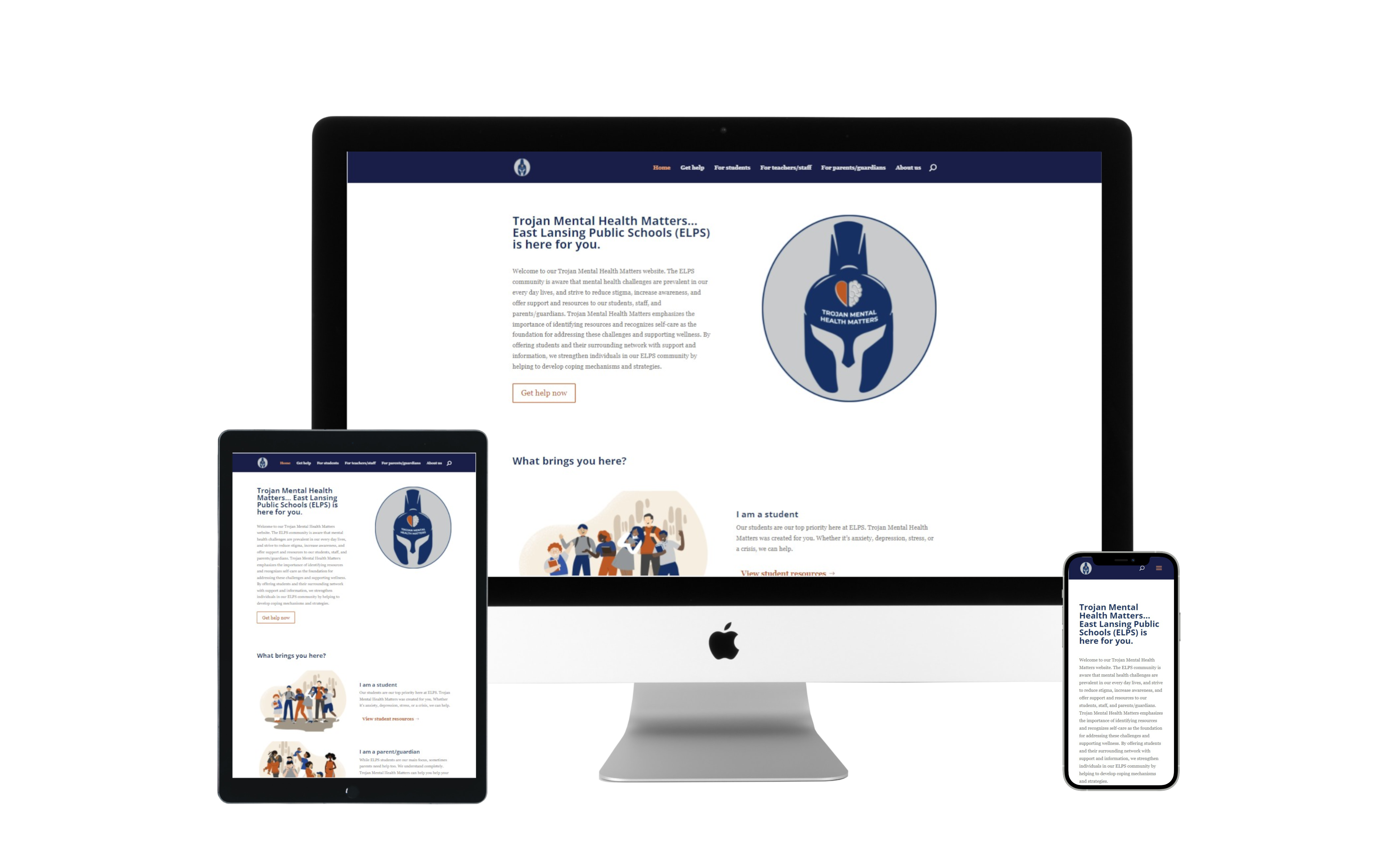
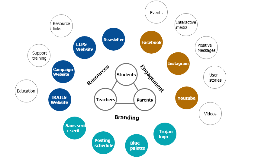
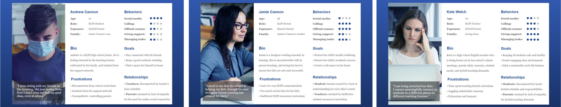
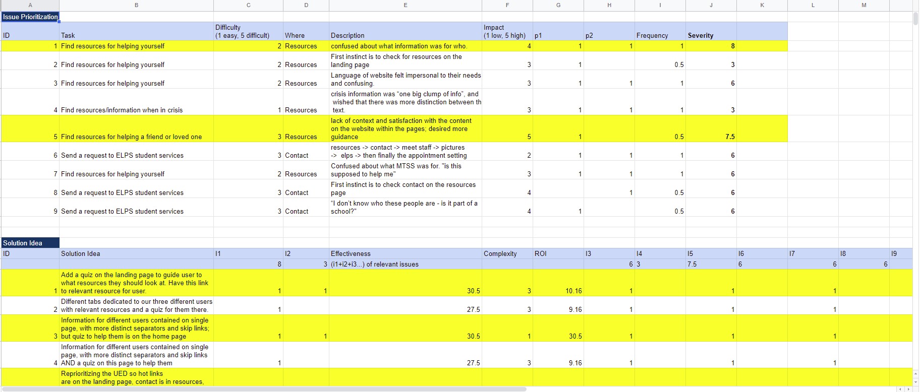
I helped design and engineer the user experience for a mental health website for East Lansing Public Schools.

My Role

User Researcher
UX Designer
UI Developer

Client

East Lansing Public Schools

Visit Website
multidevcice mockup of Trojan Mental Health Matters Website

Defining the Problem

During the Covid-19 pandemic, East Lansing Public Schools found that mental health among students, parents, and faculty were declining. ELPS wanted to create a mental health campaign that fosters hope and support for the community by educating and providing useful, accessible information about mental health for all.

Project Goals

Process

Research Methods

  • Design Review
  • Usability Testing
  • Empathy Mapping
  • Card Sorting
  • User Journey Mapping
  • Information Architecture

Project Onboarding

When my team lead and I were onboarded, most of the preliminary research for the users had already been conducted. I worked with fellow UX Designer, Emily Lin to conduct two stakeholder interviews to determine


  • What research has been conducted
  • Who were the primary targets of the website
  • How would this website meet the user needs for the campaign


We learned that the website we were about to build was part of multiple deliverables that make up the Trojan Mental Health Matters campaign and that we needed to make our website consistent with the branding guide already given.

a diagram showing how the elps campaign is structured
| Figure 1: The ELPS campaign

Understanding the Users


Following the stakeholder meetings, my team conducted a design and information review to understand what research had been conducted and what the current designs were. We found that high-fidelity wireframes had already been completed and personas had been made to represent the three primary targets of the information. These personas included Students, Parents, and Faculty.

the three personas that were created for the project
| Figure 2: Personas that were created by the research team, from left to right Students: Andrew Cannon, Parent: Jamie Cannon, Faculty: Kate Welch

From completing the information review, we found that the primary purpose of the website was to deliver relevant information about mental health and resources in as easy a manner as possible.

Our next steps were to conduct a usability test on an interactive mockup of the existing wireframes to determine the overall user experience of the current prototypes. We conducted two usability tests and our findings showed that the current layout did not adequately help our target audience find the relevant information they were looking for.

We identified three major concerns after conducting the usability test.

  • It was difficult for each primary user to find relevant information for them
  • The language and layout of the site did not target students mental health first and foremost
  • Users become lost and frustrated that they could not quickly find important information
results of usabilit test shown in a spreadsheet
| Figure 3: Usability Test Results

Our Usability test had shown us that the current designs were not focused on the users of the site. This led my team to create an Empath Map and Context Scenario for each of the user personas to understand where and how they would try to get relevant information and the thought process they would typically go through.

empathy map and context senario for andrew
| Figure 4: Empathy Map and Context Scenario

This context scenario helped us complete a card sort on a reworked information structure to target the pain points that were previously shown by the usability test. Our reworked information architecture restructured the initial wireframes to include separate and targeted information for each of our primary users instead of keeping all of the information on one page.

website card sort
| Figure 5: Card sort

Iterative Development

My team then completed low-fidelity wireframes of potential designs that were focused on all of the research we had completed. My team had split up to each develop our own version of these wireframes and then met back again to merge them together to form one complete unified high-fidelity mockup.

low-fidelity wireframe mockups
| Figure 6: My Low-Fidelity wireframes

Final Design

Our designs went through two iterations of development before we landed on the design that is shown on the website today. Once we had our designs and had them approved, we went ahead and developed the high-fidelity designs and launched the project. While Emily and I were building out the site, our graphic designer, Kaylee Mullen created the assets for the web pages. The website is being used by East Lansing Public Schools to promote wellness resources and foster a positive mental health community.

final designs of Trojan Mental Health Matters Website
| Figure 7: Final Design of the Student, Parent, and Faculty Pages

Learnings

  1. Communication is key: This was the first project I have worked on where preliminary research had already been conducted. Communicating with the stakeholder and understanding what the research had been focused on was key to our design process.

  2. Test, Test, Test: Usability testing with participants gave us the most insight into what parts of the design worked and what did not. This also helped us understand where the research team may have had biases in regards to how users would use and search the site.

Previous Project

Long's Propane Gas

Top